From Bricks to Castles: The Right Way to Build Design System Components
A deep dive into building flexible, composable UI components using the building block mindset. because great design systems aren’t built in one piece.

At first glance, building a UI component might seem simple—just wrap some HTML, add styles, and expose a few props. But when you're building for a design system, things get complicated fast.
What starts as a small, reusable component can quickly turn into something too specific and hard to adapt. You add more props to cover more use cases. You tweak styles to match edge cases. You try to make one component do everything—and in the process, it becomes harder to maintain, harder to test, and harder to use.
The real challenge is building components that can grow with your product—ones that stay useful as designs evolve and new teams adopt them in unexpected ways.
That’s why we need a different mindset—one that treats components as building blocks, not black boxes. Instead of trying to solve every problem up front, we design for flexibility, composability, and long-term scalability.

Components as Building Blocks
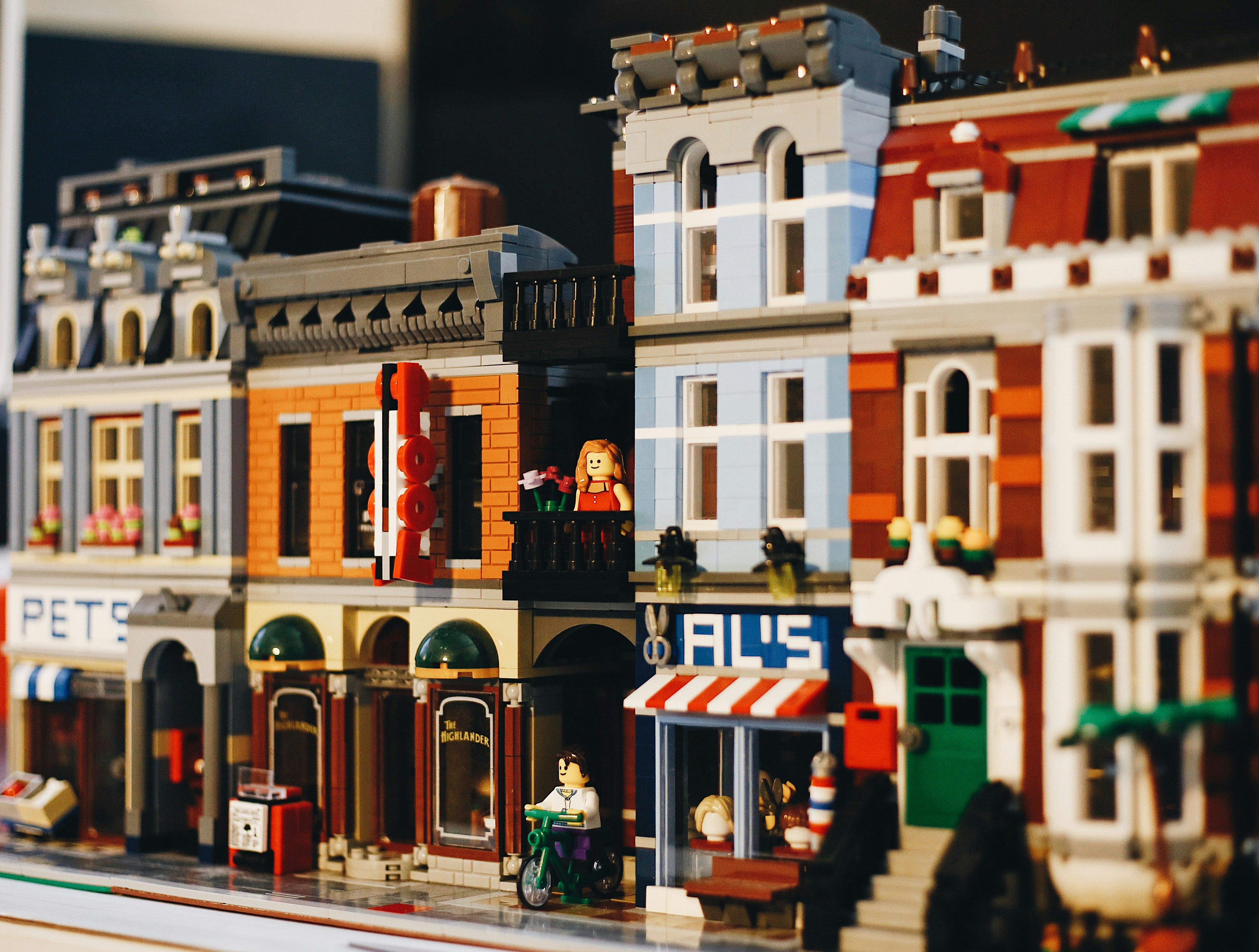
A more sustainable approach is to think of components not as final products, but as building blocks—like Lego. Each piece should be small, composable, and purpose-driven. Instead of trying to predict every use case, we design for extension. This mindset aligns closely with the compound component pattern in React, where components expose empty slots or subcomponents that consumers can assemble as needed.
This approach shifts the responsibility from the component trying to do everything, to the system enabling developers to build what they need—safely and consistently.
A Case Study: Input with Prefix/Suffix Icons
Let’s take a common example: an Input component with optional prefix and suffix icons.
The Prop-Based Approach
Traditionally, you might expose props like prefixIcon and suffixIcon:
<Input prefixIcon={<SearchIcon />} suffixIcon={<ClearIcon />} />This works fine—until it doesn’t. What if the design changes and the icon needs to be wrapped in a tooltip? Or replaced with a button? Or conditionally rendered based on some external state?
And what if you need more than one icon on either side? Maybe a search icon and a loading spinner on the left, or a clear button and a status indicator on the right. Suddenly, a simple prop isn’t enough. You start adding more props: prefixIcons, suffixButtons, onSuffixClick, showLoading, and so on.

The component becomes bloated, harder to understand, and increasingly difficult to extend without breaking existing use cases.
The Slot-Based Approach
Now consider a slot-based design:
<Input>
  <Input.Prefix>
    <Tooltip content="Search">
      <SearchIcon />
    </Tooltip>
  </Input.Prefix>
  <Input.Suffix>
    <button onClick={clearInput}>
      <ClearIcon />
    </button>
  </Input.Suffix>
</Input>
This pattern gives consumers full control over what goes into each slot, while the Input component handles layout, spacing, and accessibility. It’s more verbose, but far more flexible—and future-proof.
Need to add multiple icons? Add more functionality? Handle special requirements? No problem:
<Input>
  <Input.Prefix>
    {isLoading && <SpinnerIcon />}
    <SearchIcon />
  </Input.Prefix>
  <Input.Suffix>
    <StatusIndicator status="error" />
    <button onClick={clearInput}>
      <ClearIcon />
    </button>
  </Input.Suffix>
</Input>
You can even wrap elements in tooltips, conditionally render them, or attach custom behavior—like opening a dropdown, triggering a modal, or showing validation feedback. All of this is possible without changing the Input component itself.
This level of flexibility is hard to achieve with a prop-based API, where every new use case often leads to more props, more conditionals, and more complexity inside the component.
Slot-based composition keeps the core component clean and focused, while giving consumers the power to build exactly what they need.
Conclusion
Design systems thrive on consistency, but they survive on flexibility. By thinking in terms of building blocks, we empower teams to create complex UIs without reinventing the wheel—or breaking the system. Compound patterns and slot-based APIs are powerful tools in this journey, helping us build components that are not just reusable, but truly composable.
In the end, a good component isn’t one that does everything. It’s one that enables everything to be built—cleanly, clearly, and consistently.